MooddL

E-Learning Responsive WebApp

About

MooddL E-Learning Responsive WebApp Design

Year: 2023
Role: UX designer leading the MooddL's store app design
Responsibility: Conducting interviews, wireframing, prototyping, conducting usability studies, iterating, testing


MooddL is an e-learning platform for online universities and colleges. The main motive for creating was to get a seamless experience of completing assignments and tasks remotely from home.

"Never too old, never too bad, never too late, never too sick to start from scratch once again."
- Bikram Choudhury

Understanding the User

I conducted user interviews, which I then turned into empathy maps to better understand the target user and their needs.
I discovered that many target users treat online shopping as a fun and relaxing activity when they need a break from school or work. However, many shopping websites are overwhelming and confusing to navigate, which frustrated many target users. This caused a normally enjoyable experience to become challenging for them, defeating the purpose of relaxation.


Kickoff Study

My dad is a college professor and hence I selected this project as I wanted to overcome the issues he faced in the current e-learning platform. I had a chance to meet other people in the same field.
I started out by asking some initial key questions like,
How to make e-learning more powerful?
What experience can I improve in the current LMS system?
What do teachers and students need the most?
Who do we see our biggest competitor?
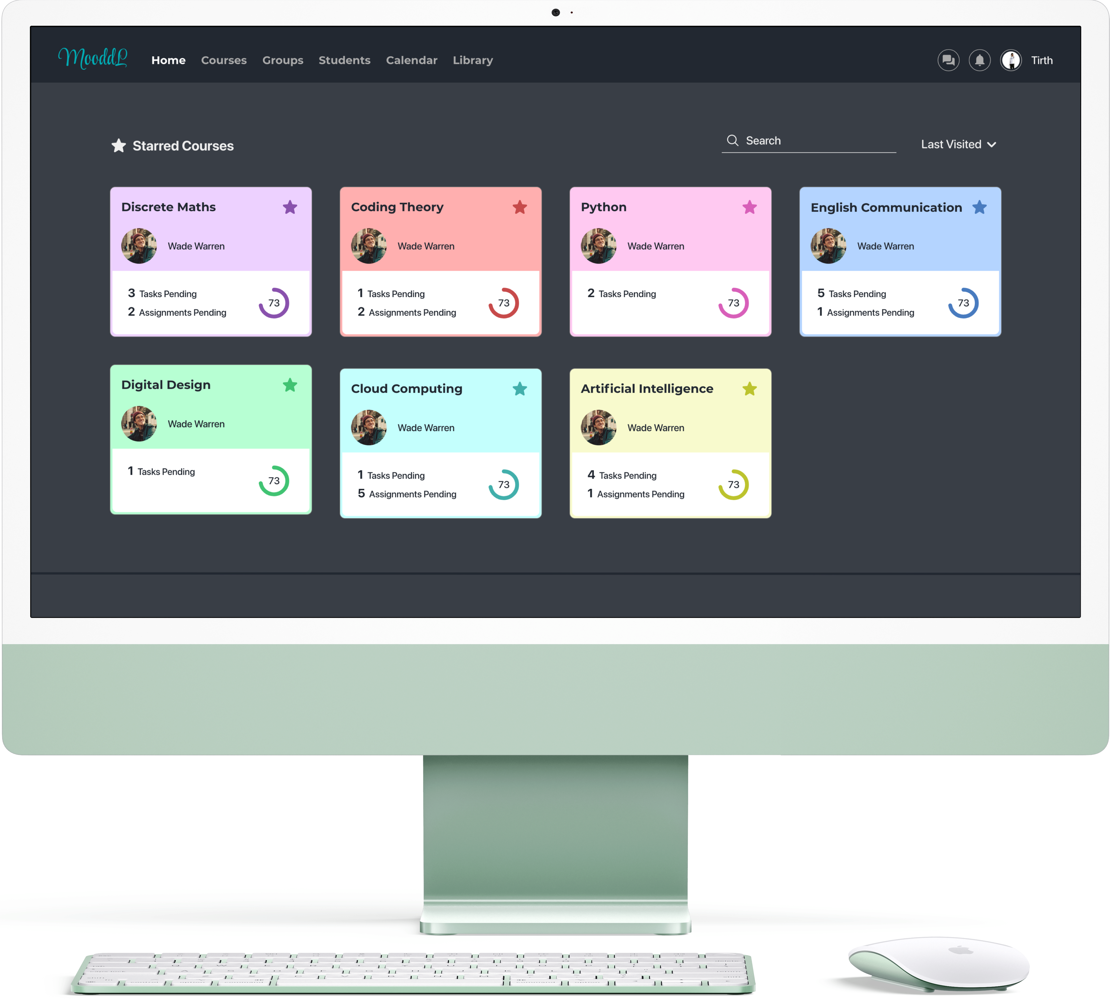
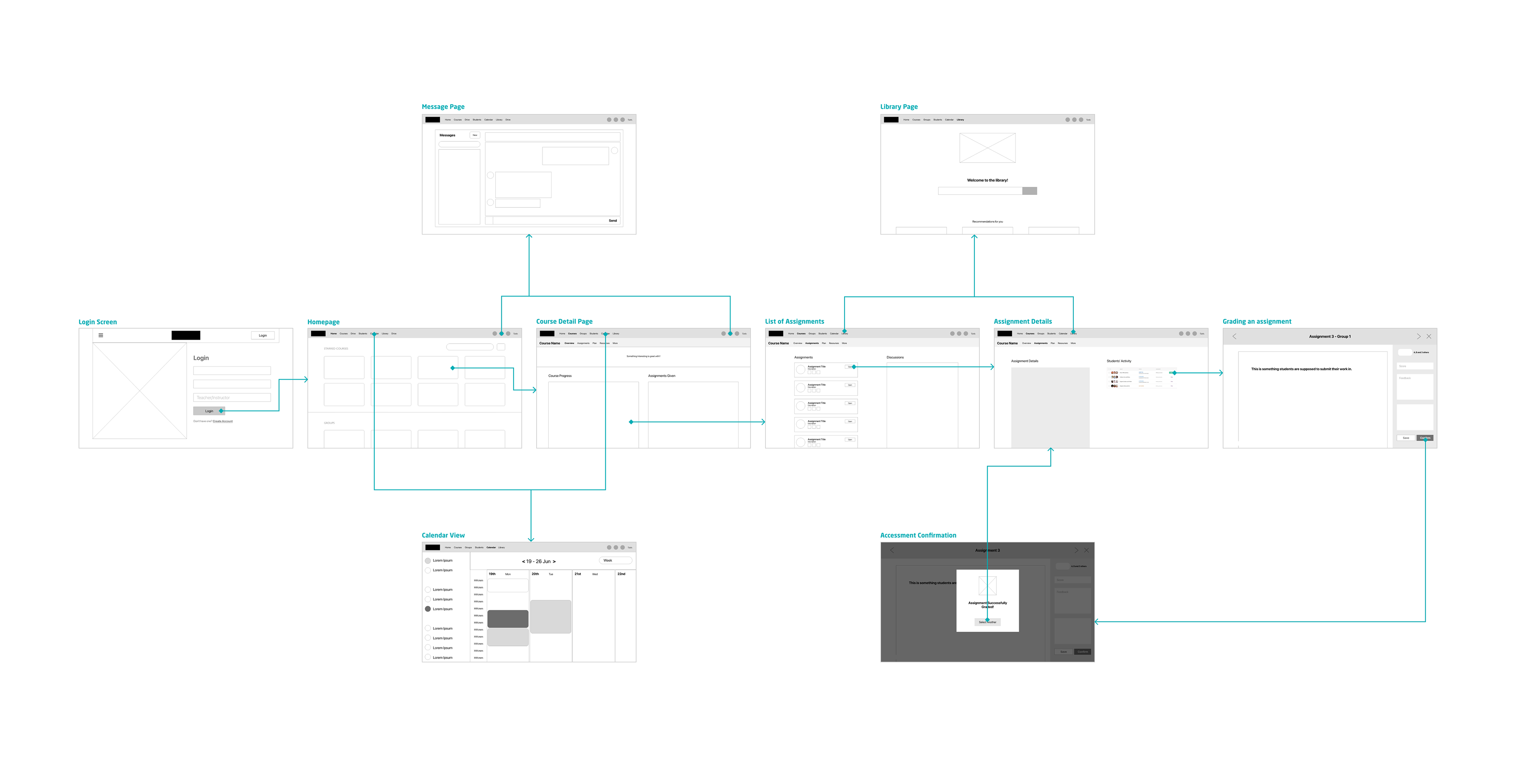
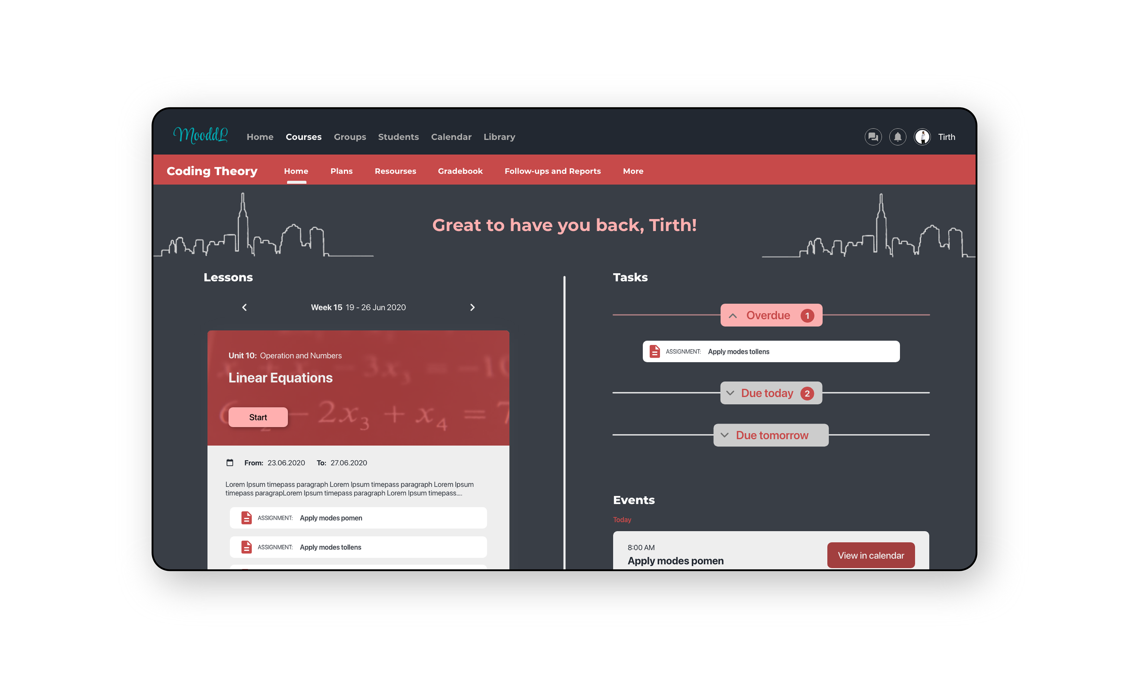
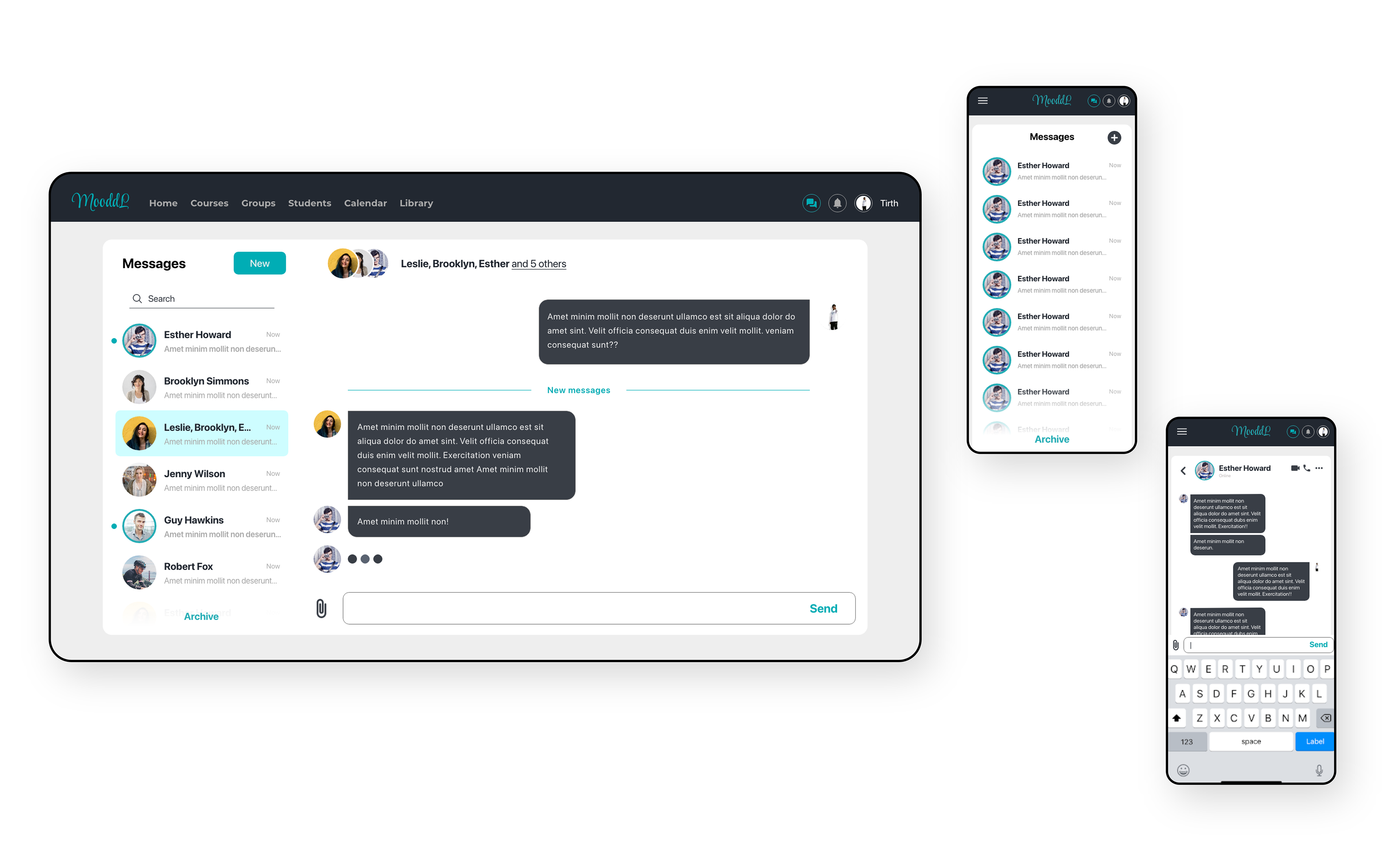
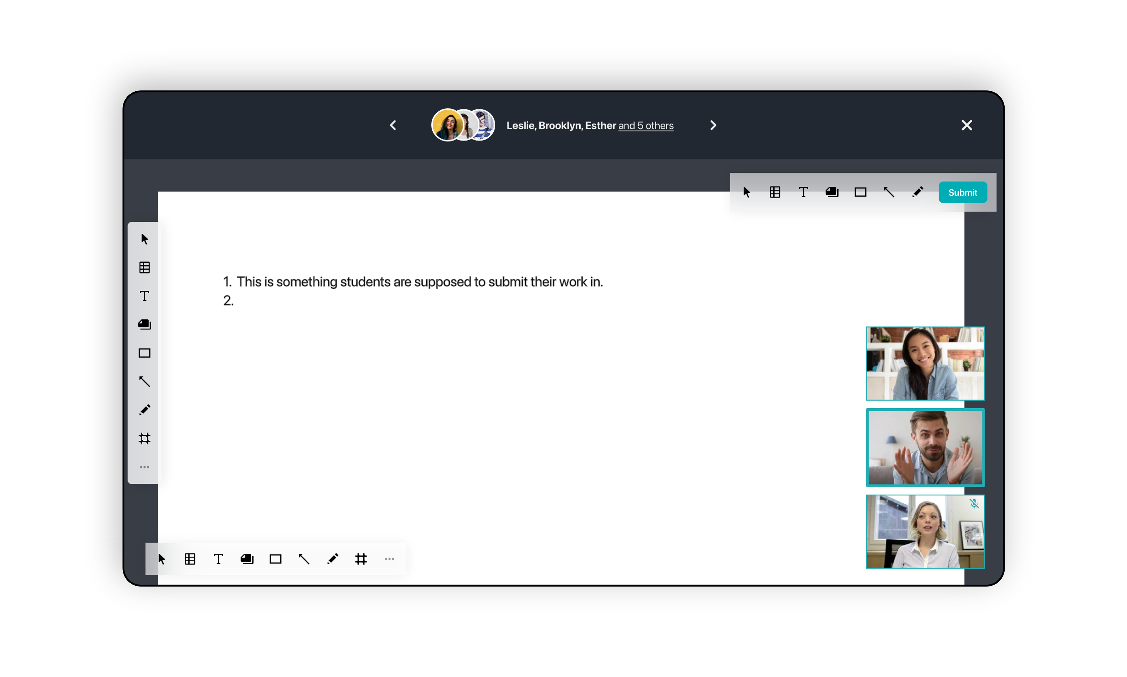
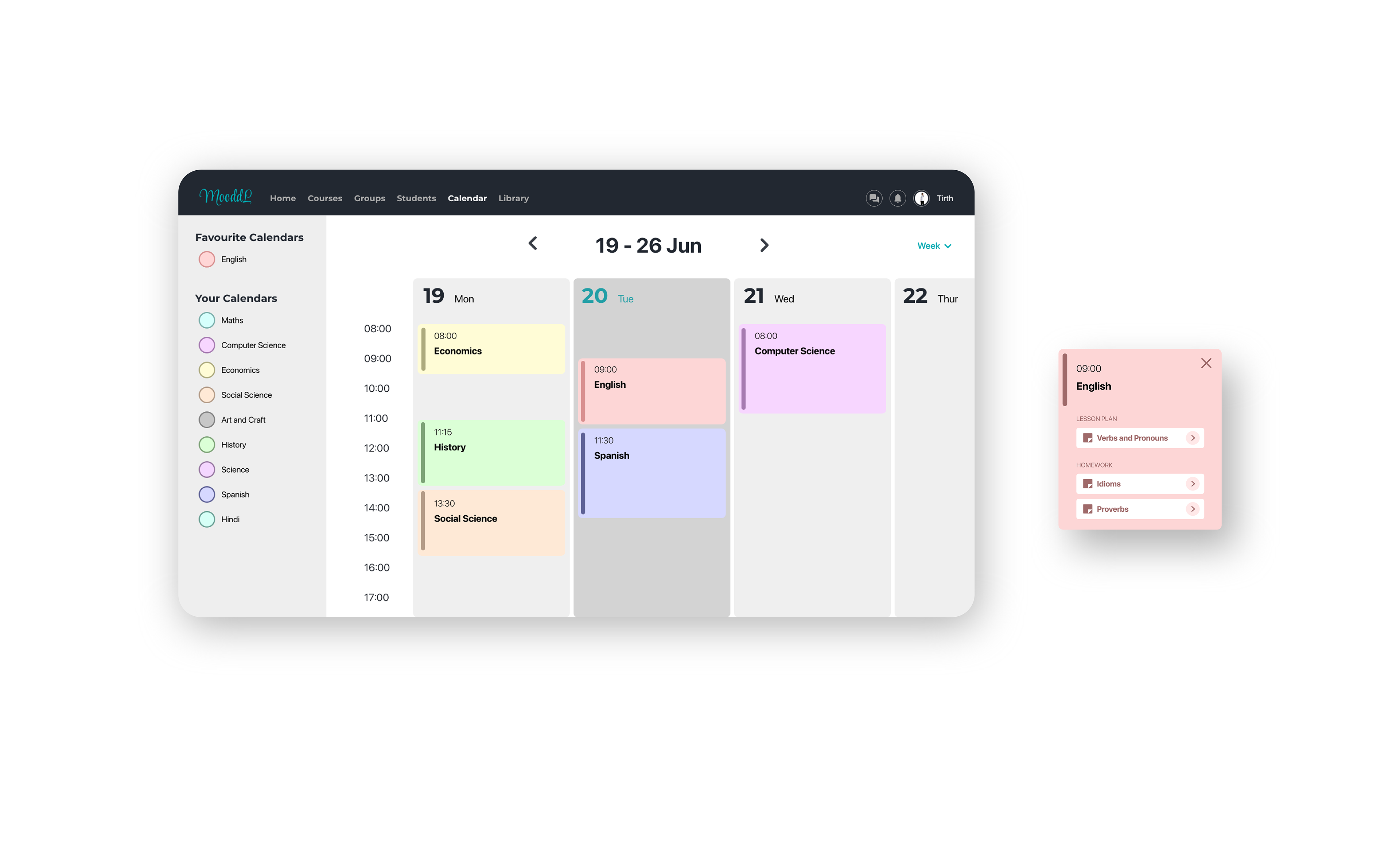
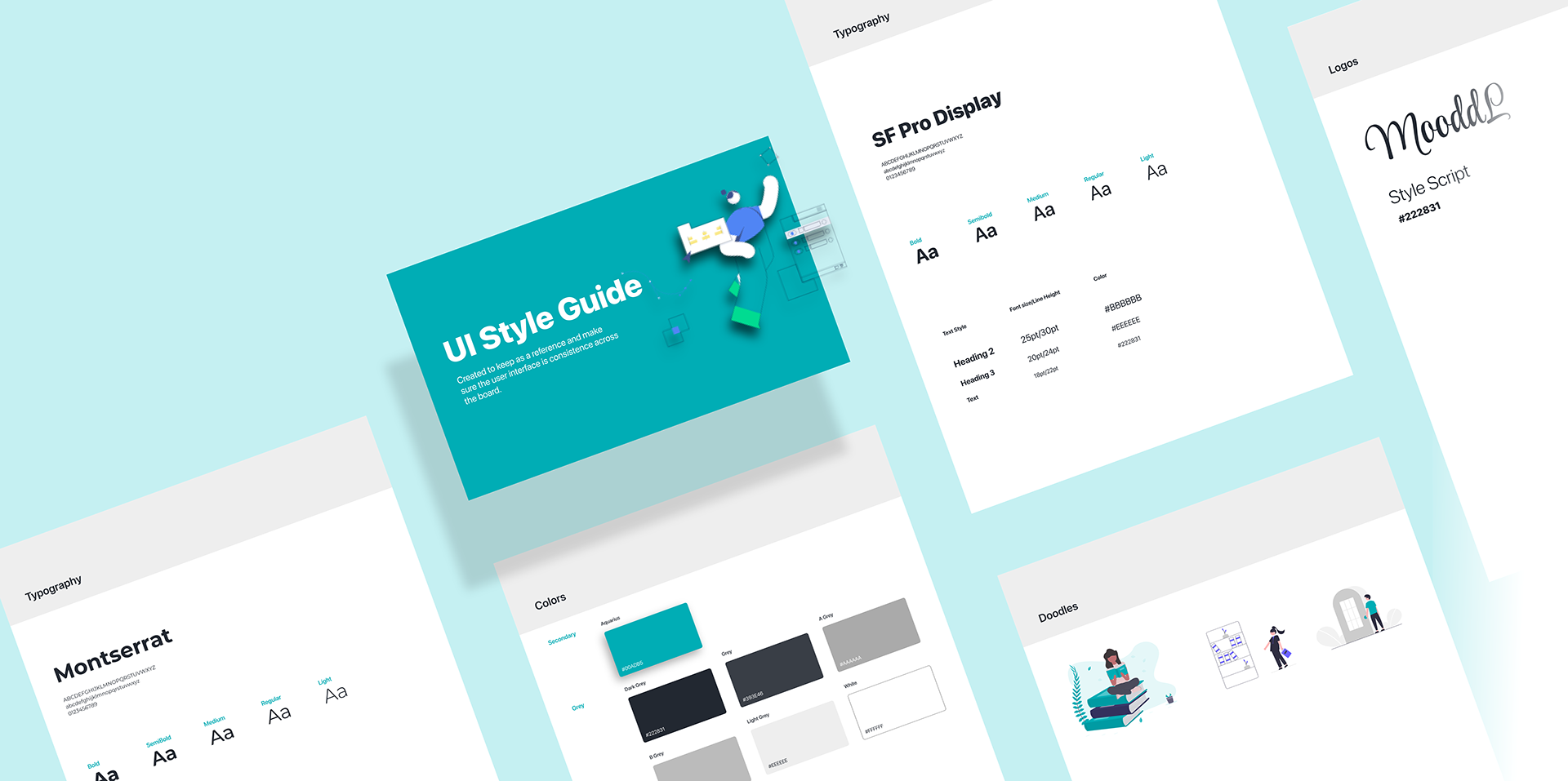
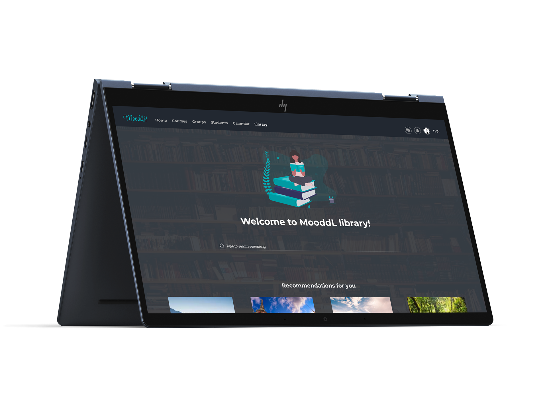
Users & Audience

The target users of the MooddL website will be any kind of teachers or instructors, students, and their parents.
The key differentiator of this user group is the purpose of using MooddL.
The key differentiator of this webapp is features like responsive design, accessibility, different versions of submissions, filter, sorting and library functionality.
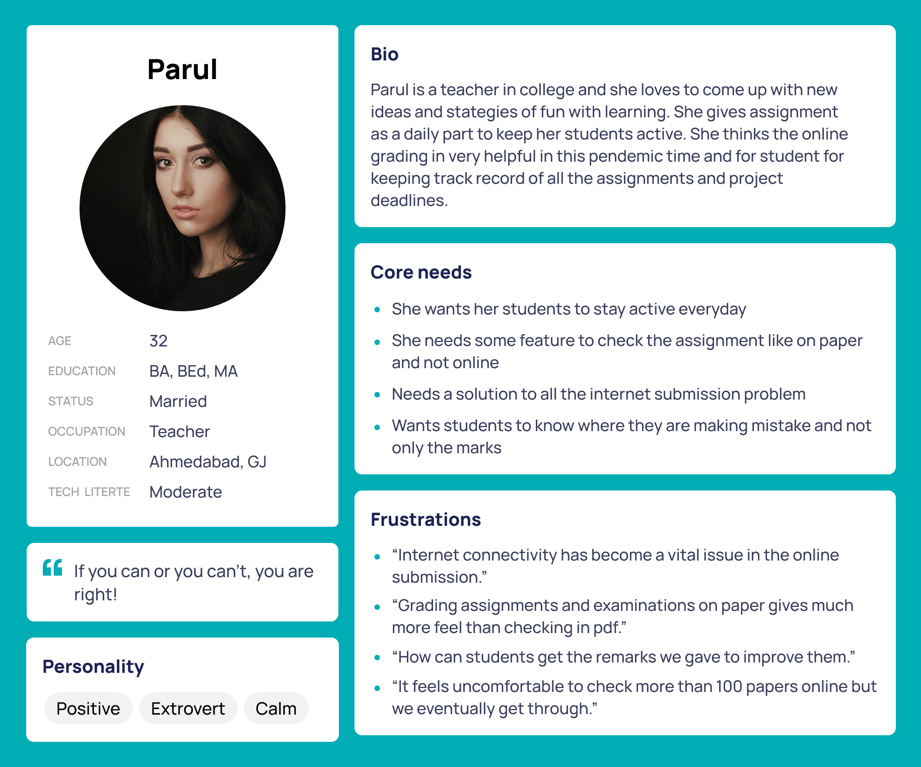
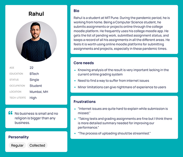
Meet the Users

Instructors or teachers want to give the work or material and students or parents want to get the instructions or get the status of any assignment or get the scores of the assignment. This brings me to assuming 2 main personas that are of a student and a teacher.


Users Pain points

From the early research study, I visited my dad's college for understanding the points from the teacher's perspective about e-learning. I was awake to some pain points, which I was concerned about before starting my design activity. According to some research analysis and a few interviews, these are the main user pain points.
Technology Adoption
Navigation and
Reassessment
Engagement and discipline
issue
Internet problem

Competitive Analysis

I looked at several potential competing companies, and although some compete directly with MooddL, they can still infringe on the business' revenue & popularity. MooddL has the opportunity to capitalize on this by bringing products from each company to create a one-platform product without oversaturating the user's selection. 

Starting the design

The Design Journey

I constructed a storyboard and from that, I constructed a user flow of what a basic start to finish journey looks like while studying online. This helped me in understanding ways users can interact with the product, as well as allowing me to see navigation through user goals.​​​​

Sitemap

Difficulty with website navigation was a primary pain point for users, so I used that knowledge to create a sitemap. 
My goal here was to make strategic information architecture decisions that would improve overall website navigation. The structure I chose was designed to make things simple and easy.​​​​​

Wireframe

Next, I sketched out paper wireframes for each screen, keeping the user's pain points about navigation, browsing, and reassessment in mind.​

The Usability Study Findings

From the usability study conducted in interviews, I came to know some more insights. People from various fields tested the prototype, different perspectives gave rise to some insights.
Add different versions of submission
Accessibility issues
Access paper again on request or for self check
Sorting and filter course option unavailable

Lo-fi Prototype

After sketching out some hand wireframes and thinking through the preliminary flow, I reviewed what was necessary, unnecessary, and what areas needed improvement. I poured a lot of time into this step to make sure I had the finishing touches on the underlying UX before moving on to the visuals.

Refining the design

Mockups

Accessibility Consideration

    Headings - I used headings with different-sized text for a clear visual hierarchy.
    Landmarks - I used landmarks to help users navigate the site, including users who rely on assistive technologies.
    Screen Readers - I designed the site with alt text available on each page for smooth screen reader access.

Screen Size Variations


Going Forward

Key Takeaway

I love keeping things clean and organized. MooddL helps to keep track of classroom progress online.
I have used a user-centered approach for my first responsive web app, keeping the user front and center, and I can definitely see it being useful as in this stage my main focus is on creating visually acceptable designs and viable interactions. I also understood that not every user has the same perspective on the same problem. I learned how important small elements are, which add up to make a difference. I understood the need of having heterogeneous user groups, for making a more effective product experience. Understanding the way the users solve the problem is also equally important.
I learned that if you design for exclusively the business' goals, it will most likely fail.
MooddL was my first key project, for a responsive web app and I had a great experience and learning. I'll keep updating the project details as I update the design.